Concise
Useful information first, detail on demand. A screen does not show everything the software knows, it shows what you need to know to decide.

Project management software all looks alike: lists, tabs, forms, and the information you need three clicks away. Particular effort went into pylotik's usability to move away from that: screens that are fast to use, concise and highly visual, where meaningful colors give complete visibility at a glance.
A pylotik screen answers a question, and the answer reads without searching. Colors do not decorate: they say a status, a delay, an alert, an actor. What needs a decision stands out from the rest.
Each role has its view. Leadership, the project manager, the contributor and the client do not look at the same screen: they look at the same data, from the angle that serves them. Nobody has to dig through a screen designed for someone else, or rebuild a dashboard by hand before each meeting.
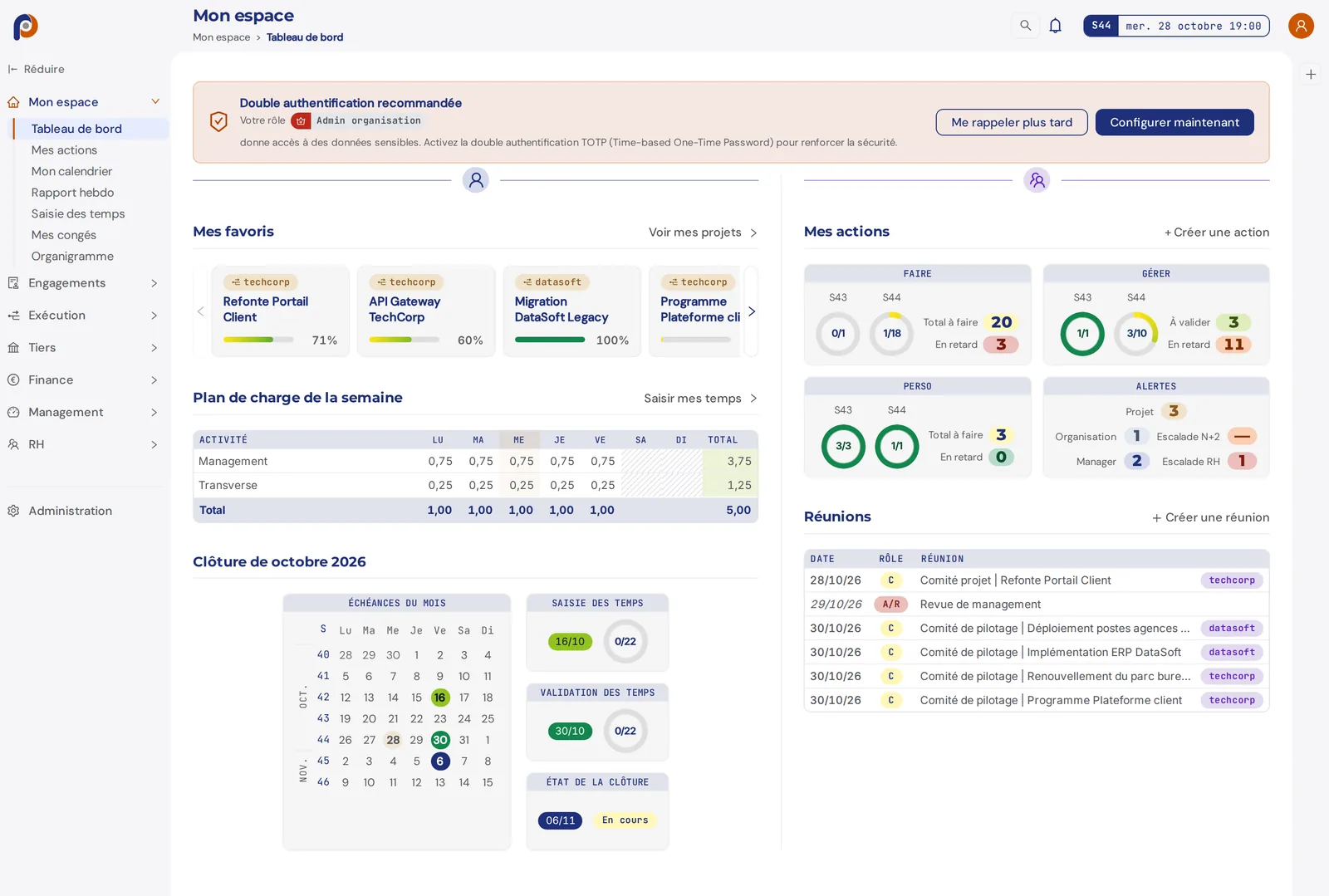
Usability is designed for efficiency: less time filling in the tool, more time on the facts it makes visible.
Useful information first, detail on demand. A screen does not show everything the software knows, it shows what you need to know to decide.
Dated facts rather than comments: what was produced, decided, approved. That is what lets you steer on what is real, not on impressions.
The shortcuts people like in Excel are still there: copy, paste, undo. You keep the speed of a spreadsheet, in a more modern interface.
The pylotik web application is fully adapted to small screens: every screen stays readable and usable on a smartphone. So you can use it at the coffee machine, when walking over to the teams in the open space, or at a client's site, without waiting to get back to your desk.
Nothing to install for that: it is the same application, in the phone's browser.
Alongside the web application, the mobile app is made first for contributors: reporting on their actions, and knowing what they have to do. Here again, the screen is designed to show as much as possible and act fast. Details on the mobile app page.
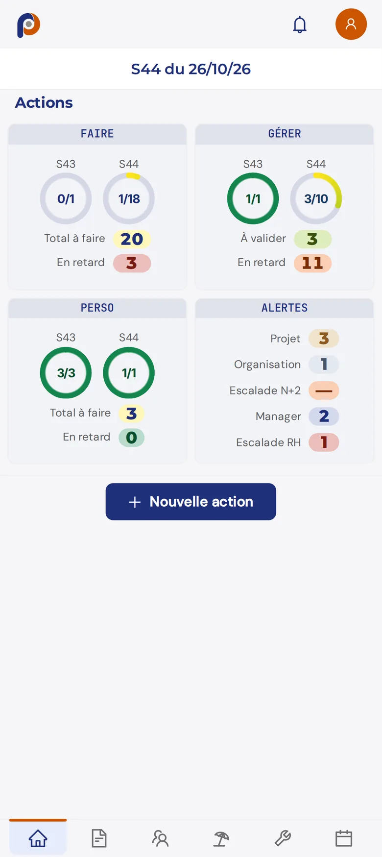
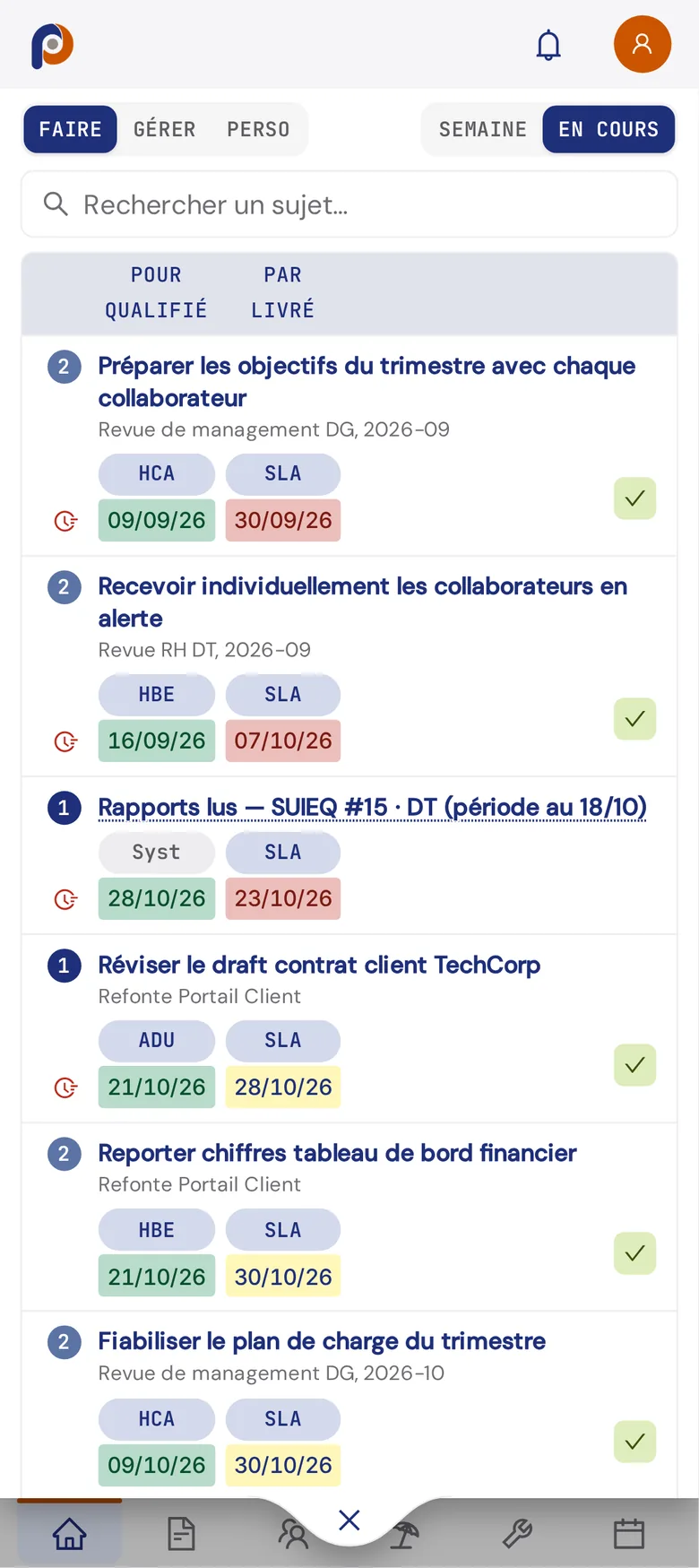
Yes. The web application is fully adapted to small screens: all its screens stay readable and usable on a smartphone, in the browser.
The web application gives access to everything. The mobile app is made for contributors' short tasks: reporting on their actions, entering their time, knowing what they have to do. It is added to the phone's home screen, without an app store.
Yes for the most useful shortcuts: copy, paste and undo. The rest of the interface is designed to be faster than a spreadsheet, with the information already structured.
The demo runs on a data set that is already filled in, on a large screen as on a phone.